v6.5.0 Release Notes
Written by Ryan Battles
Updated on Apr 13, 2021
New Waste Stream List View
Over the past months we've received requests for the Waste Stream list view to:
- Add more fields
- Make it more mobile friendly
- Filter by Company and Site
We're happy to announce that with this release, we'll be rolling out a beta version of our new Waste Stream list view and advanced search, and we're excited to hear your feedback!
To access the new list view...
Navigate to your Waste Streams then click on the Take a Look button in the purple banner:

New List View Features
In this section we'll describe the features available in the new list view!

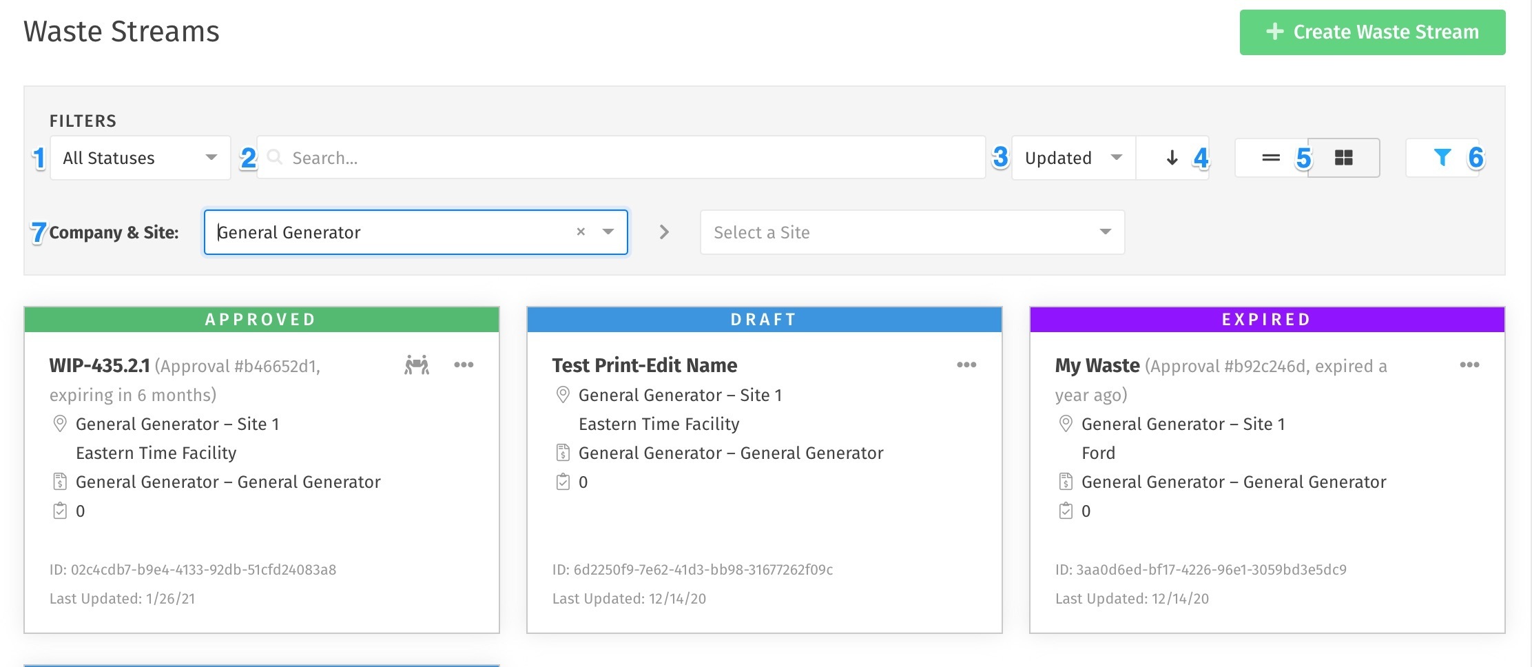
- The status filter will enable you to filter Waste Streams by Draft, Submitted, Approved, Expiring, etc. just like you did before.
- The search bar functions just as before, where you can search for any keyword that appears on the Waste Stream cards or listview items.
- The sort function allows you to sort based on any number of items such as when the waste stream was last updated or the companies on the Waste Stream.
- The sort arrow allows you to sort either ascending or descending based on the sort option you selected in #3.
- Switch between the new list view and the new card view by selecting either option here.
- Click this icon to show or hide the advanced filters.
- Filter easily by company and site!
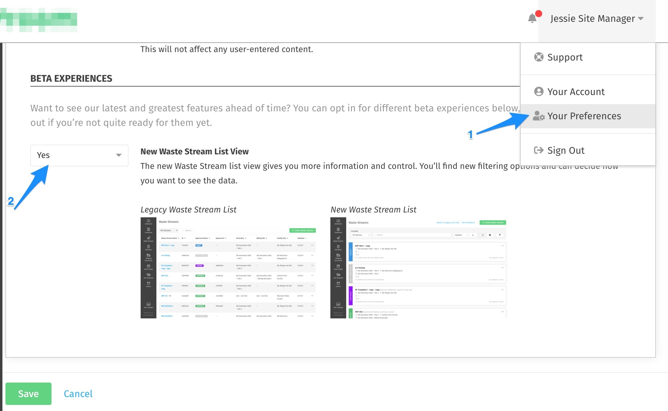
Want to switch back?
You can easily toggle back and forth between the old view and the new version via the Take a Look! button in the list view, or if you've cleared the purple bar you can change your settings at any time in your User Preferences:

Let us know what you think!
We'd love to hear your feedback on our new list view.
Fixes
- Approval numbers for some Waste Streams were showing in email notifications before they were approved, so we made sure that any email notifications for Draft and Submitted Waste Streams do not have approval numbers displayed.
- We made some tweaks to make integrating to our API run smoother.
- Some users were unable to create new Sites, so we got that issue cleared up.
- Some drop down menus were overlapping making it confusing to make selections, so we got those working properly.